


Configuring Custom Dashboards
The 'Custom Dashboards' interface allows administrators to view updated results from event queries as pie charts, bar charts time charts and spider charts. By viewing important data from often complex queries in an easily digested chart format, administrators can more effectively track, monitor and analyze the activities of their customers. Refer to the section 'Configuring Event Queries' to know more about event queries.
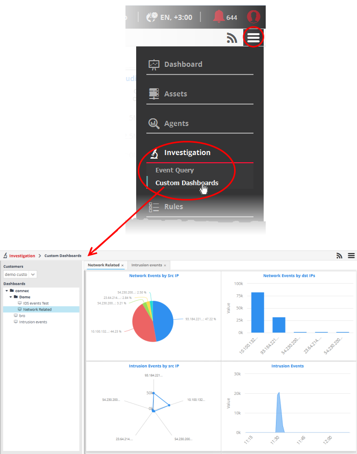
To open the 'Custom Dashboards' interface, click the 'Menu' button from the top right, choose 'Investigation' and then click 'Custom Dashboards'.
|
Custom Dashboards Interface – Table of controls |
|
|---|---|
|
|
The 'Customers' drop-down allows you to select the customer for which you want to query events and/or add custom queries. |
|
|
Allows you to add a new 'Dashboards' folder to the left side panel |
|
|
Allows to edit the name of a 'Dashboards' folder |
|
|
Allows you to a add a new dashboard by selecting an event query added for the selected customer. |
|
|
Allows to delete selected dashboards folders or dashboards. |

The interface allows administrators to:
You can create and manage dashboard folders to accommodate the custom dashboards of specific type and to display them as tree structure.
To create a new Dashboard Folder
- Select the parent folder under which you wish to create a new folder
- Click the
 button at the bottom of the screen.
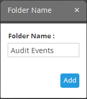
- Enter a name for the folder and click the 'Add' button
The folder will be saved and displayed on the left side.

You can add new dashboards under the folder.
To edit the name of a dashboard folder
- Select the folder and click the
 button at the bottom
- Edit the name as required and click the 'Save' button
To delete a custom dashboard folder
- Select the folder and click the
 button at the bottom.
The confirmation dialog will appear.
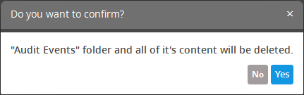
- Click 'Yes' to confirm the deletion.
You can add any number of custom dashboards for a customer for different event queries. If required, you can create new queries specifically for custom dashboards and save them, from the Event Query interface. For a tutorial on creating new queries, refer to the explanation of Manage an Event Query in the section Configuring Event Queries.
- Name - A name to identify the chart.
- Selected Event Query – The query whose results are to be displayed in the chart. The query can be selected from the list of queries, added fro the selected customer. The events that are detected based on the query for the last one hour will be displayed in the charts.
- Group By – The field, based on whose values, the events identified by the query are to be grouped and shown in the chart. Event groups will be formed so that each event group will have events with same value for the selected field.
- Aggregation Function - The event groups formed based on the fields chosen in the 'Group by' option, are ranked based chosen 'Aggregation Function'. The event groups are indicated in the charts in ascending or descending order as chosen in the 'Order by' setting. The available options are:
- Count - The event groups are ranked based on the number of events in each group. For example, if you choose Source IP as 'Field' then the group which contains the most events on a particular source IP will have the top rank and the group containing the lowest number of events is ranked lowest. You can further control how the data is displayed by modifying the ‘Order By’ and ‘Limit’ parameters.
- Sum - The event groups are ranked based on sum of values in another field that contains numerical value. If you choose 'Sum', you need to select another field that contains a numerical value, like 'bytes in'/'bytes out'. The event groups are ranked based on the sum of the values in the chosen numerical field from all the events in that group. For example, if we choose 'Bytes-in' as numerical value, then the system adds up the values in the 'Bytes-in' field of all the events in a group and ranks the group accordingly. The event group having the sum of values in the 'Bytes-in' field as maximum is ranked top and vise-versa.
- Average - Similar to above. Event groups are ranked based on the average of the values of the chosen numerical field from all the events in that group. (e.g. the average of values of 'Bytes_in' field of events in the group, if we take the same example as above)
- Maximum - Similar to above. The event groups are ranked based on the maximum of the values of chosen numerical field from all the events in that group.
- Minimum - Similar to above. The event groups are ranked based on the minimum of the values of chosen numerical field from all the events in that group.
- Order By - You can choose the order in which the event groups are to be indicated in the chart, based on their ranking. The available options are:
- Ascending - The group with the lowest rank will be top of the list. A limit of 5 will show the 5 groups with the lowest ranks.
- Descending - The group with the highest rank will be top of the list.. A limit of 5 will show the 5 groups with the highest ranks.
- Limit – The number of event groups to be displayed in the chart
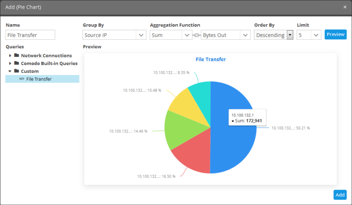
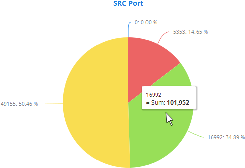
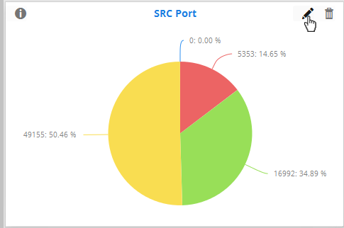
The screenshot below shows the resulting dashboard chart constructed with the parameters as described above:
- Create and save a query for identifying file transfer events
- Construct a chart by selecting the query
- Group the events by Source IPs
- Aggregate the event groups by the sum of 'Bytes-out'
- Set the chart to display top 5 groups in descending order
To create a new dashboard
- Select the customer from the 'Customers' drop-down at the top of the left hand side panel.
- Select the appropriate folder or create a new dashboard folder under which you want to create a new dashboard. Alternatively, you can also select a folder while saving a dashboard.
- Click the
 button.
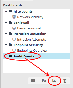
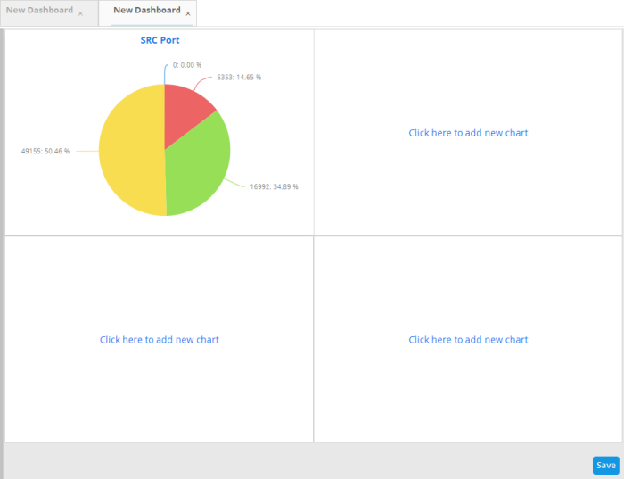
A 'New Dashboard' tab will be displayed.
|
Tip: You can also use the 'New Dashboard' tab that is displayed as the first tab on selecting a customer, to create a new dashboard. You can save the created dashboard by selecting an appropriate folder from the left side panel. |
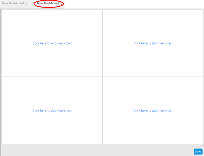
The new dashboard contains four tiles to display four charts.
The option to select the graph type to show the query results will be displayed.

The available options are:
- Pie Chart
- Bar Chart
- Spider Chart
- Time Chart
- Click on a graph type from the options
The 'Add' screen will be displayed for configuring the results to be shown in the chart.
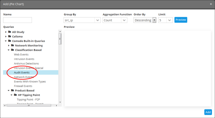
The left hand side pane allows you to enter a name for the chart and displays the list of event queries that were pre-configured for the customer's network. You can select the event query for which the chart is to be displayed, from the list. The right hand side pane displays options for configuring the chart and a preview pane.
|
Add Chart – Form Parameters |
|
|---|---|
|
Parameter |
Description |
|
Name |
Enter an appropriate name for the dashboard tile |
|
Queries |
Displays the list of predefined and custom event queries added for the selected customer. Select the event query for which the results are to be displayed in the chart. |
|
Group By |
The drop-down displays the event query results table column headers configured for the selected event query. Refer to 'Configure results table for a query' for more details. Choose the column header of the results table, based on which the results are to be grouped in the chart. |
|
Aggregation Function |
Allows you to choose the aggregation operation to be applied for ranking the event groups and show them in ascending or descending order, in the chart. The options available are:
|
Allows you to choose the order in which the event groups are to be indicated in the chart, based on their ranking. The available options are:
|
|
|
Limit |
Enter the number of events to be displayed for the chart |
|
Preview |
This button allows to preview the chart before adding it to the tile |
|
Add |
Click this button to add the chart to the dashboard tile |
- Enter the parameters for the chart as shown in the table above and click the 'Preview' button to check the chart before adding it to the dashboard tile

Placing the mouse cursor over a section will display the details of that particular event query.
- Click the 'Add' button
The configured tile will be added to the dashboard.
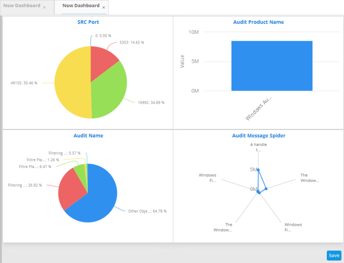
- Repeat the process to add more number of tiles to the dashboard as explained above.
- Click the 'Save' button.
The 'Save' dialog will appear.
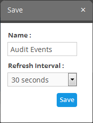
- Enter the name for the dashboard in the 'Name' field
- Select the period at which the event query results chart should be updated from the 'Refresh Interval' drop-down. The options range from 30 seconds to 5 minutes.
- Click the 'Save' button
The dashboard will be saved and its name will be displayed on the tab and under the folder it was saved.

You can add as many custom dashboards for various event queries configured for a customer by repeating the same process.
Creating an Event Query for Specific Events from the Dashboard Chart
You can create new event queries for the customer to view the filtered results from the dashboard tiles.
To create a new query
- Click on the portion of the chart that indicates the events for which a new query is to be built
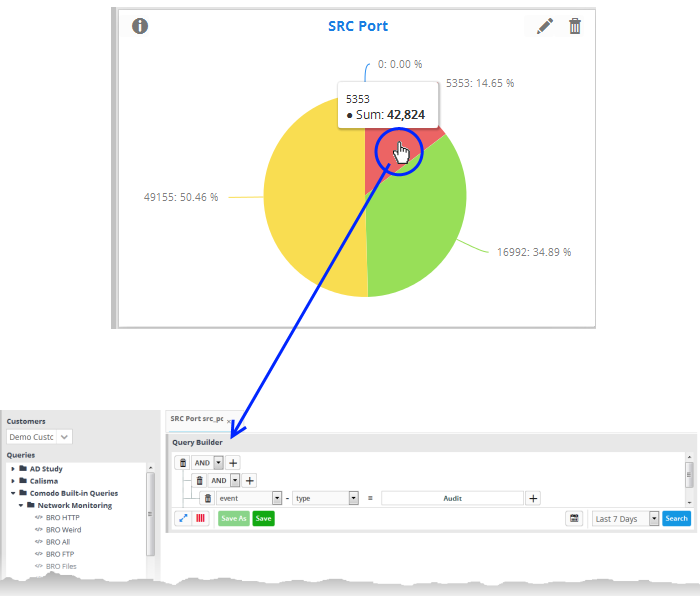
The query builder will open for the customer, with all the query parameters pre-configured for the specific event type indicated in the chart.
- If you want to change the parameters, directly edit on the 'Query Builder' interface.
- To view the results of the query, click Search. The results will be displayed as a table in the lower right pane.
- Choose the folder in which the query is to be saved, from the list of folders in the left hand side pane and click 'Save'
The Query will be saved. You can search for the events at anytime using the query.
The custom dashboard tiles can be edited at anytime to change the query for which the results are displayed, the grouping and aggregation operation of the results and so on.
To edit a dashboard tile
-
Place the mouse cursor over a tile to view the 'Edit', 'Delete' and 'Tool Tip' icons.
- Click the 'Edit' icon
The 'Update' screen will appear.
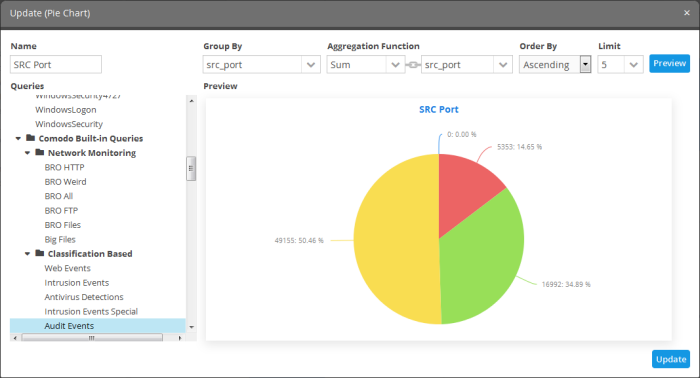
- Edit the chart details as required and click the 'Update' button
Deleting a Custom Dashboard Tile
You can remove unwanted tiles from the dashboard, at anytime, and make room for new tiles to be added.
To delete a tile
- Place the mouse cursor over a tile to view the 'Edit', 'Delete' and 'Tool Tip' icons.
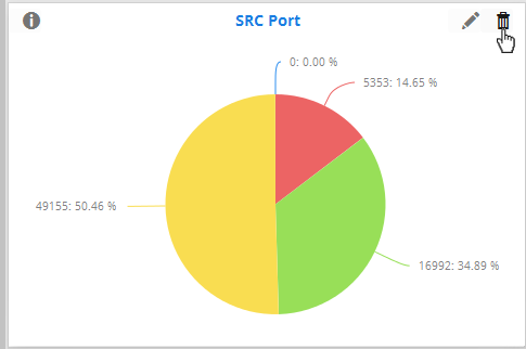
- Click the trash can icon.
The confirmation dialog will appear.
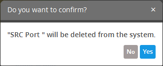
- Click 'Yes' to confirm the deletion.