Threat Communication Graph
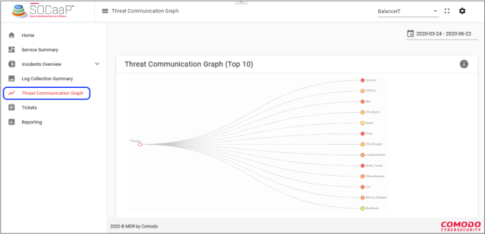
Click 'Threat Communication Graph' on the left and select a customer at top-right
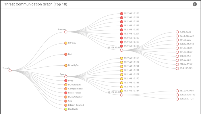
- This graph shows how external IPs attempted to communicate with internal IPs to deliver specific types of threat.
- Click a threat category on the right to reveal the internal addresses targeted by that type of attack.
- Next, click an internal address to see the IPs that contacted it to try and deliver the threat.
- The color-tone of the circle indicates the volume of communications. White = low, yellow = medium, red = high.


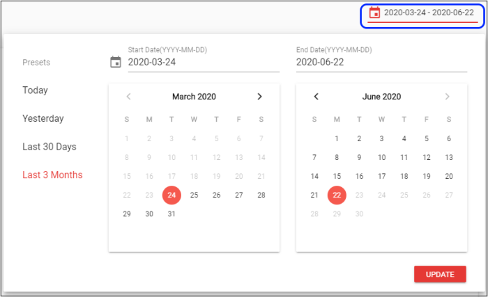
- Statistics are shown for the past seven days by default
- Click the date above the chart if you want to view a different time-frame:

View threats in tree view
- Click a threat to the view the details of affected internal IPs

- Click an internal IP to view details of threat from blacklisted IPs
- Node color tones range from white to red depicting the intensity of threat communication
- Click again to collapse the tree view.


