Charts Page
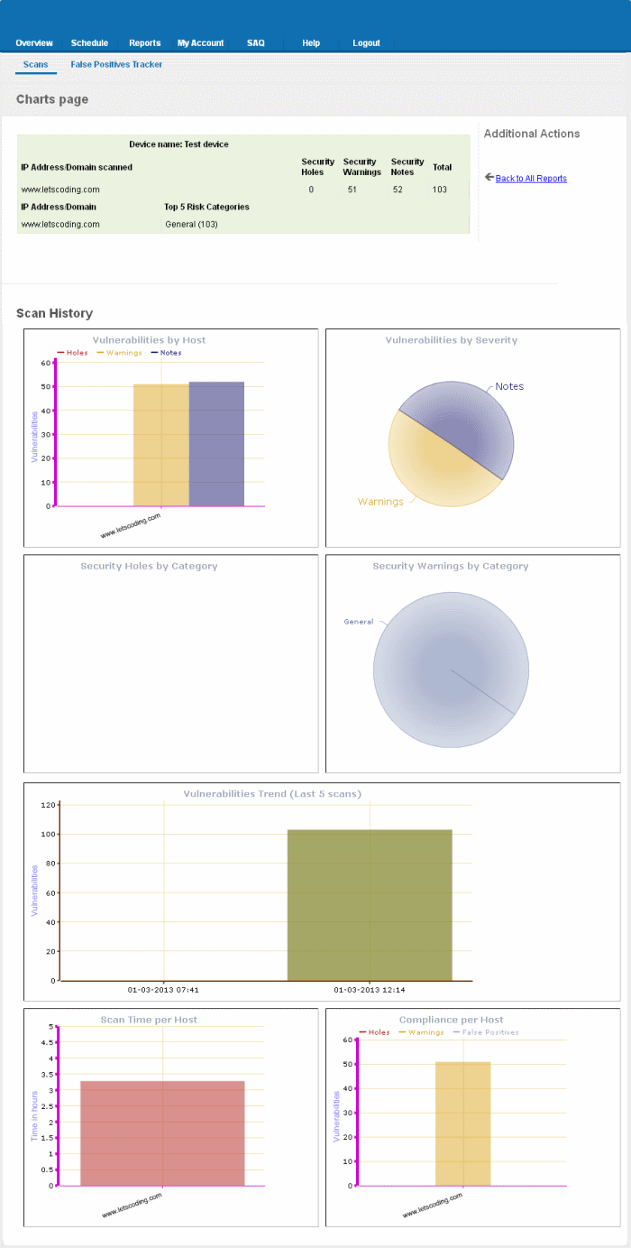
The Charts Page contains at-a-glance summary of the scan results on the device at the top and graphical representations of proportions of identified vulnerabilities according to their categories.
To view the Chart Page of a Device,
click the Report Charts button ![]() in the row of the Device.
in the row of the Device.
| Tip: You can also click the charts page button beside the Device name from the 'Device List' area to view the page. |
An example of the Charts Page is given below.

Summary
The summary table provides the list of IP addresses/Domains pertaining to the device scanned and the number of Security Holes, Security Warnings and Security Notes identified in each IP/Domain.

Scan History
The scan history section contains bar-graphs and pie diagrams indicating the proportions of vulnerabilities according to their categories.
Vulnerabilities by Host - A
graphical representation of the information regarding the security
holes found, security warnings, and security notes per host. Each
category is represented by a different color. Pointing the mouse
cursor over a bar in the graph displays the count of the respective
item found. The graph enables administrators to gain both an overview
of the overall of health their network and to monitor the security of
individual hosts within that network.
Vulnerabilities by Severity- A pie-diagram representation of proportions of security holes,
security warnings, and security notes found for the entire device.
Pointing the mouse cursor over a sector in the diagram displays the
percentage proportion of the respective item found.
Security Holes by Category -
A pie-diagram representation of proportions of security holes of
different categories like Trojan Horses, file R/W exploits, Remote
Procedure Call (RPC) exploits etc., found for the entire device.
Pointing the mouse cursor over a sector in the diagram displays the
number and percentage proportion of the respective item found.
Security Warnings by Category- A pie-diagram representation of proportions of security warnings of
different categories like Firewall exploits etc., found for the
entire device. Pointing the mouse cursor over a sector in the diagram
displays the number and percentage proportion of the respective item
found.
Vulnerabilities Trend - A
graphical representation of the comparison of the vulnerabilities
found in the IPs/Domains of the device during the last five scans.
This gives the trend of the reduction in the number of
vulnerabilities in successive scans because of the remediation
actions taken at the end of each scan. Each IP/Domain in a device is
indicated with a different color. Pointing the mouse cursor over a
bar in the graph displays the number of the vulnerabilities found in
the respective IP/Domain in the respective scan. This graph also
indicates the administrator on the frequency of the scans and enables
to check whether scans are being conducted according to their
pre-defined scan schedule.
Scan Time per Host - A graphical representation of the time taken for scanning each IP/Domain in the device. Pointing the mouse cursor over a bar in the graph displays the time taken fr the IP/Domain in hours.
Compliance per Host - A graphical representation of the PCI compliance adhered by the IPs/Domains of the device. Pointing the mouse cursor over a bar in the graph displays the number of security holes, warnings and false positives reported.


