System Usage Summaries
The 'System Graphs' screen
shows resource usage for the past 24 hours. This includes CPU, system
memory, swap memory and disk drive use.
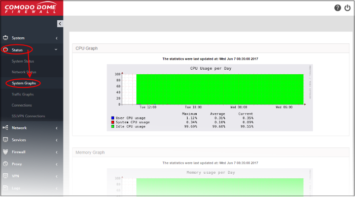
To open the interface, click 'Status' on the left then 'System Graphs':

Clicking any graph will show more information about that component. Click the following links for details on each:
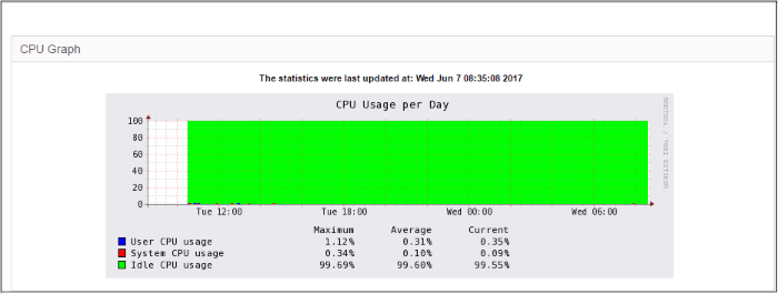
The 'CPU Graph' displays the load on the DFS server CPU over the past 24 hours. Processes are indicated with different colors.
- Green - Idle, CPU was not used by any of the processes
- Blue - User initiated processes, run with default priority
- Red - System processes

The table below the graph shows the maximum, average and current load of the CPU for the past day from various processes. Clicking the graph opens a new page with detailed CPU usage history graphs for the past day, week, month and year.
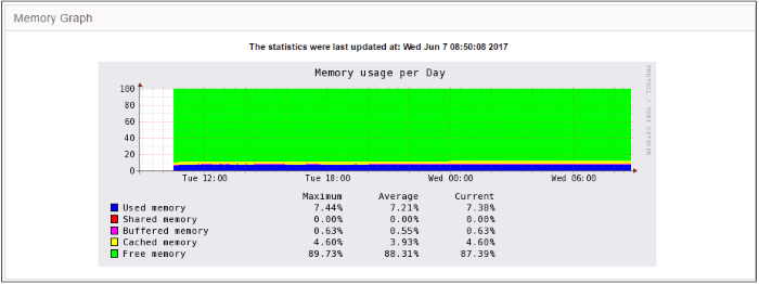
The 'Memory Graph' shows memory usage over the past 24 hours. The different types of memory are indicated with different colors.
- Blue - Memory used by running processes
- Red - Memory shared by concurrently running processes
- Pink - Buffered memory space used for temporarily storing data received from or sent to external devices
- Yellow - Cached memory, used for storing recent data used by running processes
- Green - Free, unallocated memory

The table below the graph shows statistics of maximum, average and current usage of system memory for the past day. Clicking the graph opens a new page with detailed memory usage history graphs for the past day, week, month and year.
The 'Swap Graph' shows the usage of the swap area in the hard disk, used for storing data from inactive processes, from the system memory. Different types of swap spaces are indicated with different colors.
- Blue - Used swap space
- Green - Free swap space

The table below the graph shows statistics of maximum, average and current usage of swap space for the past day. Clicking the graph opens a new page with detailed usage history graphs for the past day, week, month and year.
The 'Disk Graph' shows disk access levels over the past two days.

- Green - Percentage of sectors accessed for writing into the disk
- Blue - Percentage of sectors accessed for reading from the disk
The table below the graph shows maximum access, average access and current usage of the disk space over he past two days. Clicking the graph opens a new page with detailed access history graphs for the past day, week, month and year.


