


Agent Design
- Click 'AI' > 'AI Agent' > 'Manage Your AI Agent' > 'Agent Design' to open this interface.
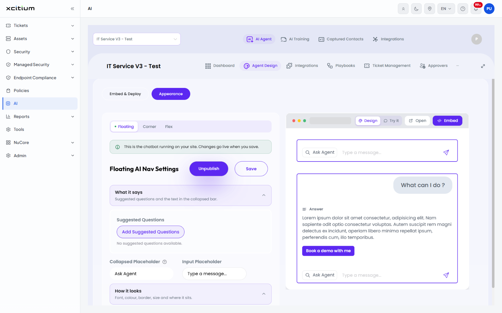
The 'Agent Design' tab controls how the agent's chat widget looks on your website and how it is put there. It has two sub-tabs, 'Embed & Deploy' and 'Appearance'. 'Appearance' is shown first.
A live preview of the widget sits on the right of the screen with four buttons above it: 'Design', 'Try it', 'Open' and 'Embed'.
Widget layout
Three buttons at the top of the settings panel choose the layout: 'Floating' (selected in the example), 'Corner' and 'Flex'. A note under them reads 'This is the chatbot running on your site. Changes go live when you save.'
The settings panel is headed with the layout name, for example 'Floating AI Nav Settings', and carries two buttons: 'Unpublish' and 'Save'. The settings are grouped into four sections you expand and collapse.
'What it says'
'Suggested questions and the text in the collapsed bar.'
| Field | Control | Description |
| Suggested Questions | Button | 'Add Suggested Questions' adds a question visitors can click. When none are set the panel reads 'No suggested questions available.' |
| Collapsed Placeholder | Text box | The text in the collapsed bar. Example value 'Ask Agent'. |
| Input Placeholder | Text box | The grey text inside the message box. Example value 'Type a message...'. |
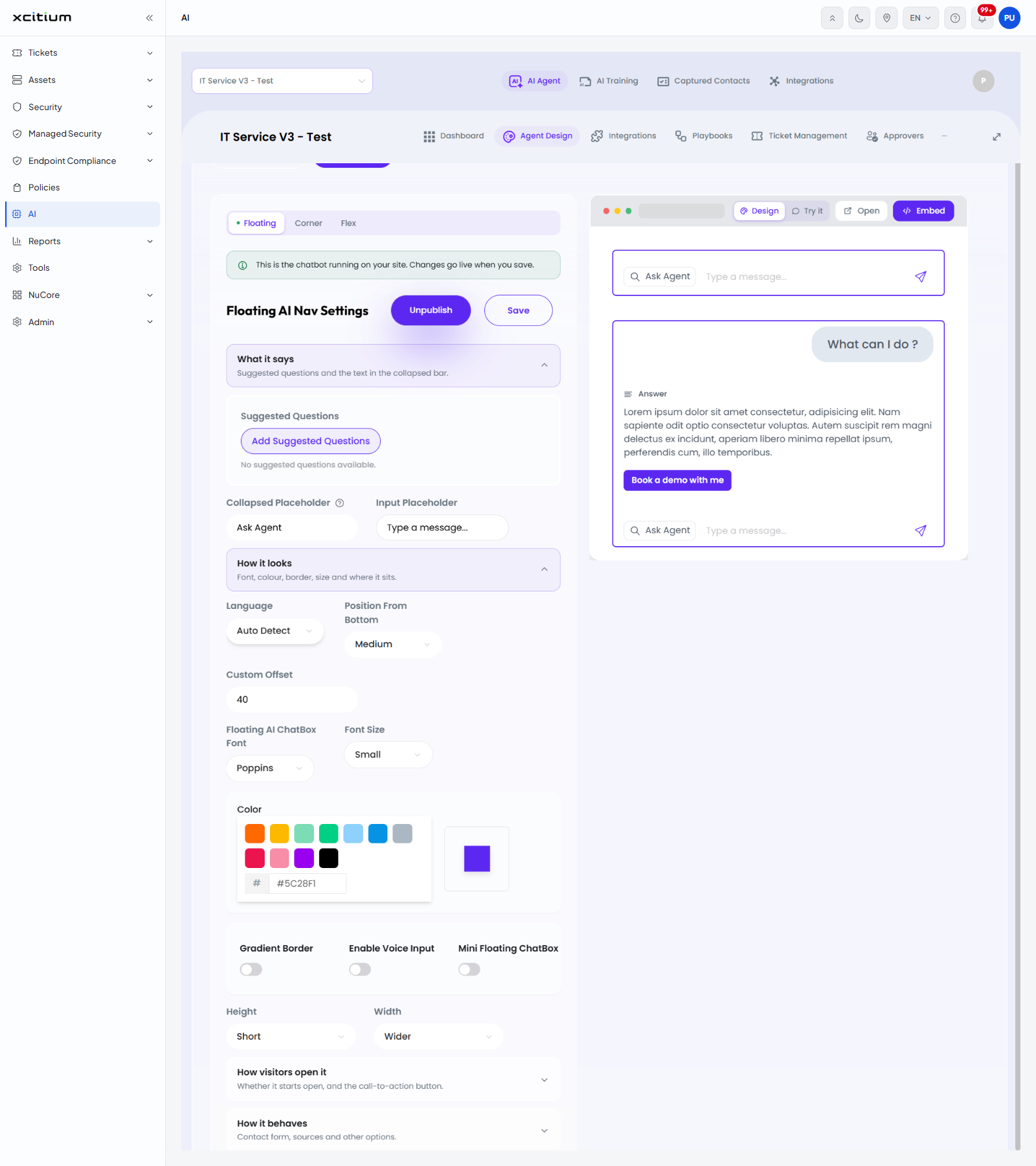
'How it looks'
'Font, colour, border, size and where it sits.'
| Field | Control | Description |
| Language | Drop-down | The language of the widget. Example value 'Auto Detect'. |
| Position From Bottom | Drop-down | How far up the page the widget sits. Example value 'Medium'. |
| Custom Offset | Number box | A precise offset in place of the preset. Example value '40'. |
| Floating AI ChatBox Font | Drop-down | The typeface. Example value 'Poppins'. |
| Font Size | Drop-down | Example value 'Small'. |
| Color | Swatches and hex box | Ten preset colours and a '#' box for an exact value, with a large preview square. Example value '#5C28F1'. |
| Gradient Border | Toggle | Off in the example. |
| Enable Voice Input | Toggle | Off in the example. |
| Mini Floating ChatBox | Toggle | Off in the example. |
| Height | Drop-down | Example value 'Short'. |
| Width | Drop-down | Example value 'Wider'. |
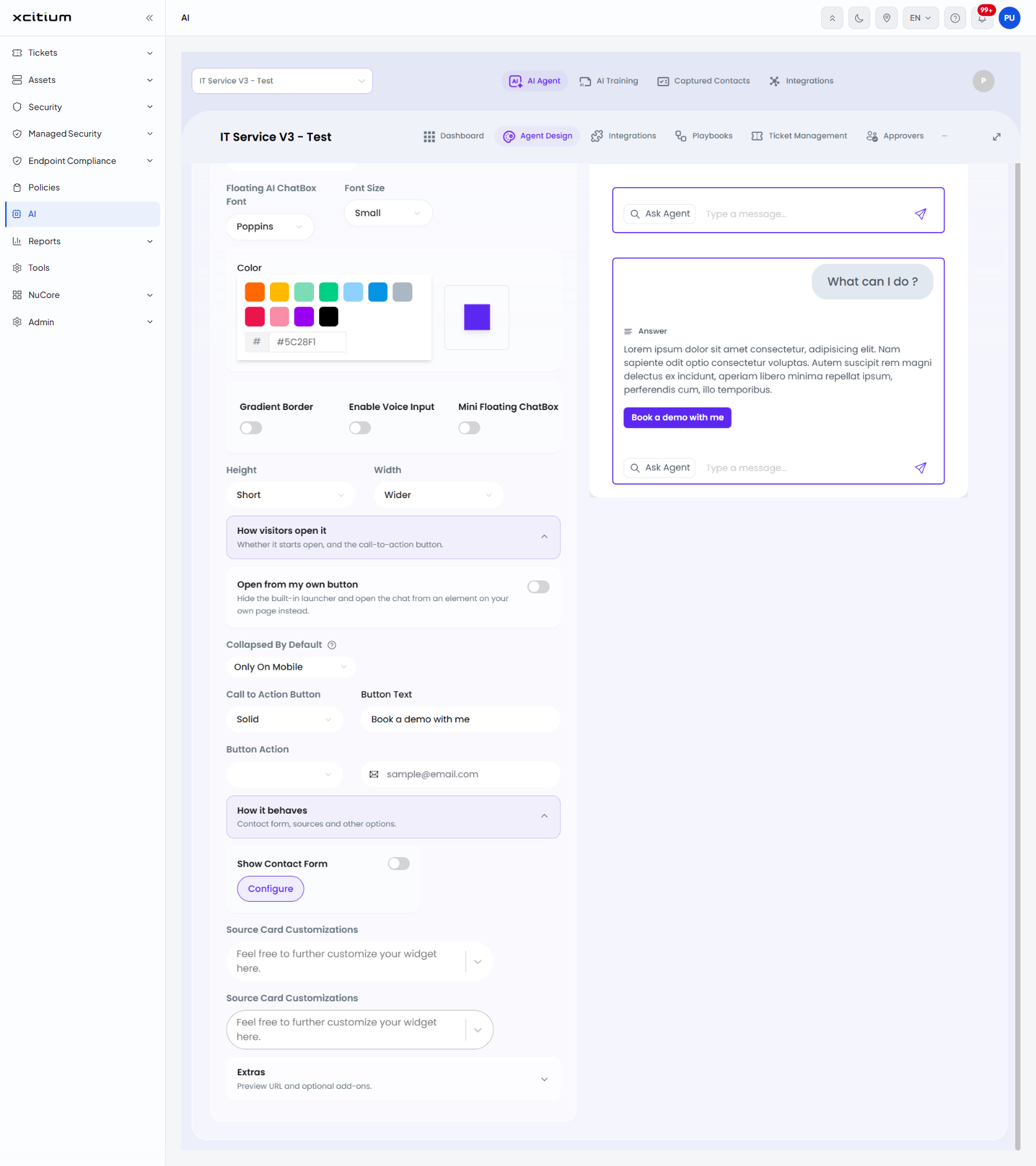
'How visitors open it'
'Whether it starts open, and the call-to-action button.'
| Field | Control | Description |
| Open from my own button | Toggle | 'Hide the built-in launcher and open the chat from an element on your own page instead.' Off in the example. |
| Collapsed By Default | Drop-down | Example value 'Only On Mobile'. |
| Call to Action Button | Drop-down | The button style. Example value 'Solid'. |
| Button Text | Text box | The wording on the button. Example value 'Book a demo with me'. |
| Button Action | Drop-down and text box | What the button does, with a box for the address it uses. The box carries the example 'sample@email.com'. |
'How it behaves'
'Contact form, sources and other options.'
| Field | Control | Description |
| Show Contact Form | Toggle and button | Off in the example. 'Configure' opens the contact form settings. |
| Source Card Customizations | Two collapsible panels | Both carry the line 'Feel free to further customize your widget here.' |
'Extras'
'Preview URL and optional add-ons.' The section holds a 'Preview Website Url' box and an 'Update' button.
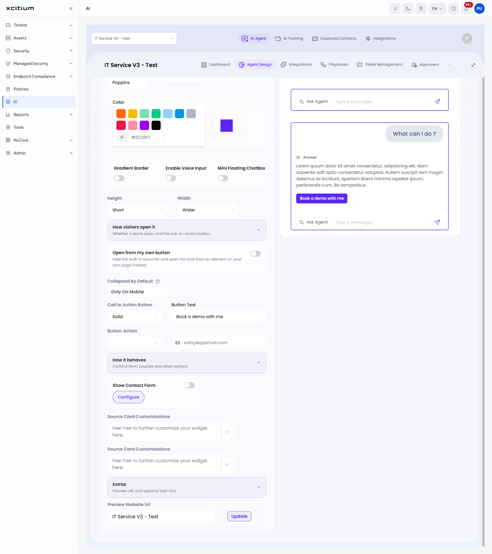
Change the look of the widget
- Click 'AI' > 'AI Agent' > 'Manage Your AI Agent' > 'Agent Design'.
- Click the 'Appearance' sub-tab.
- Choose 'Floating', 'Corner' or 'Flex'.
- Expand 'What it says', 'How it looks', 'How visitors open it', 'How it behaves' or 'Extras' and change the settings you need.
- Watch the preview on the right of the screen.
- Click 'Save'. The change goes live on your site.
Note: 'Unpublish' takes the widget off your site. 'Save' publishes the change immediately.